You know how your phone now offers to “fix” your photos with AI? Everyone’s eyes are open, nobody’s mid-blink, the lighting is perfect… and somehow the best bits are gone. The silly face your kid pulls in every candid. The dog photobombing in the corner.
I’m seeing a lot of website redesigns lately that have clearly been done through AI, and somewhere along the way the personality of the website got stripped out. The personalised photos and fun design elements are gone, replaced by short, to-the-point sentences, em dashes and “not X, but Y” phrasing.
The team photo? Gone. The story of how the business started — gone too. If your website once sounded like you, then now it sounds like everyone. It’s not a redesign. It’s a replacement. And in today’s fast-paced digital landscape? That matters.
See what I did there? 🙃
These new websites might get the brand’s message across and tick the SEO/GEO boxes, but I sometimes miss the “mediocre” websites. The ones where a human clearly pored over every detail, even if there was the occasional typo or goofy outdated photo.
The polished, AI websites look professional, but they feel cold and filled with empty promises.
There’s something to be said for the old team photo
After 20 years in marketing, I still have a soft spot for those slightly imperfect websites where you can tell someone cared about the details. Maybe the photos were a few years old. Maybe the copy wasn’t as polished as it could have been. But you could see the people, get a sense of their humour and understand what mattered to them.
That doesn’t mean we should leave broken menus or typos alone in the name of character. A website still needs to work on a phone, be accessible and make it easy to find the right information. It does mean that, before we remove something in a redesign, it’s worth asking why it was there in the first place.
A dated team photo might need replacing with a current one. An owner’s long story might need editing. But if those details help a visitor understand who they’re dealing with, they may be worth keeping in some form.
Why websites can start to look alike
AI can be brilliant at getting a first version together. Without enough context or direction, though, it can fall back on familiar choices.
Anthropic, the company behind Claude, has written about this in its own frontend design research. In one experiment, it observed that Claude tended towards safe, predictable layouts when left without intervention. Its frontend design guidance also points to recurring defaults such as familiar fonts, purple gradients and cookie-cutter components.
Paul Cash, author of Humanizing B2B, has a great name for this: the great dehumanizing of B2B. He’s noticed so many AI-first companies with the same purple gradients, glowing dashboards and big promises that it’s as if they all hired the same creative director (he jokes it’s Claude). His line that stuck with me: “You cannot efficiency your way to being interesting.” He’s talking about B2B tech brands, but I think it applies just as much to the local accountant, plumber or café down the road.
That’s a useful reminder that a website can be technically functional and still feel interchangeable. It also doesn’t mean that every purple gradient or simple layout is a problem. What matters is whether the choices suit the business and the people it wants to reach.
The same goes for the words. Short sentences, em dashes and phrases like “not this, but that” aren’t proof that someone used AI. Humans use them too. But when every page has the same clipped rhythm and a collection of broad promises, it can be hard to hear the business’s own voice. The author of The Field Guide to AI Slop makes a similar point: writing habits alone aren’t a reliable way to identify AI. Specific knowledge and a genuine point of view matter more.
What the research says about AI content and trust
In a 2026 YouGov survey, 45% of the 1,046 Australian adults surveyed said they would trust a brand less if they found out its advertisements were created mainly using AI. The same survey found that 86% thought brands should clearly disclose when their ads were mainly AI-generated.
That research was about advertising, not website design or code. It doesn’t tell us that visitors distrust websites built with AI assistance. It does suggest that transparency about AI-generated content matters to many people.
A separate 2026 study of website imagery asked 43 participants to compare websites using photographs with sites using AI-generated images. Before the use of AI was disclosed, participants tended to prefer the sites with AI-generated imagery. After disclosure, trust shifted towards the sites with photographs, with stronger differences in health and government settings.
It was a small study about images, not the tools used to write code. But it’s an interesting reminder that visual appeal and trust aren’t always the same thing.
What gets lost in a generic rewrite
Imagine a local accounting firm whose old website had a photo of the team, a bit about how the founder started out at her kitchen table, and a line promising not to judge anyone’s shoebox of receipts. A redesign replaces all that with a faceless illustration and this sentence:
Empowering your financial future.
It sounds professional enough, but it doesn’t tell a visitor much. Compare it with:
We help tradies, cafés and family businesses across Newcastle get their books sorted.
That example is fictional, but the difference is real. The second version tells you what the business does, who it’s for and where it works. Add a photo of the actual team and there’s a much clearer picture of who you’ll be talking to.
Here’s what that generic version tends to look like. It’s a mock-up of a fictional business, not a screenshot of a real website.
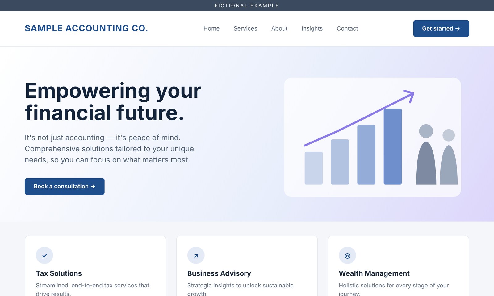
Illustrative example: a polished template with a broad message, a faceless illustration and the obligatory em dash.
You can care about SEO and still sound like yourself
A website should help people find you, understand what you do and decide whether you’re right for them. That includes thinking about traditional search engine optimisation (SEO) and how people discover information through AI-powered search.
Google’s guidance for its AI search features says the familiar SEO fundamentals still apply: make content useful, keep important information available as text, and help search engines find your pages. It doesn’t prescribe a separate visual style or a special set of technical requirements for those features. Following the guidance also doesn’t guarantee that a site will appear.
Google also talks about E-E-A-T: experience, expertise, authoritativeness and trustworthiness. It describes these as aspects of content quality, with trust at the centre. Google says E-E-A-T itself isn’t a specific ranking factor, so there’s no checklist that guarantees a higher position in search.
For a business website, the practical side is straightforward: make it easy for people to see who you are, what you know and why they should feel comfortable getting in touch. A named author, a genuine project story or an explanation drawn from your own experience can help a reader understand your expertise. The details need to be real and useful; simply adding a photo or an author bio won’t guarantee better rankings.
A clear page about your services, written in your own voice, can do both jobs. It gives people useful information while making the business easier to understand. For a closer look at the different ways people find businesses online, see our guide to SEO, GEO and AEO in plain English.
How Method Marketing uses AI in web design
We use AI to help us code faster and work more efficiently. It can help with repetitive tasks, offer a starting point and make it easier to explore technical solutions. That gives us more time to focus on the decisions that need care.
We still want to understand the business, the people in it and what makes it different. Our website design process starts with your goals and your customers. We review the work and shape the design around your brand and visual identity, rather than accepting a generic first output as the finished product. The aim is a site that works well, reflects the way the business actually speaks and has a personality of its own.
That might mean keeping a story that explains how the business began, making a frequently asked question easier to find, or replacing an old team photo with a new one. We also test the site across devices before launch, so the personality doesn’t get in the way of someone using it.
We’ve written more about the role of human judgement in our article on why AI can’t tell you what your business stands for.
If you’re thinking about a redesign, let’s talk about your website and what’s worth holding on to.