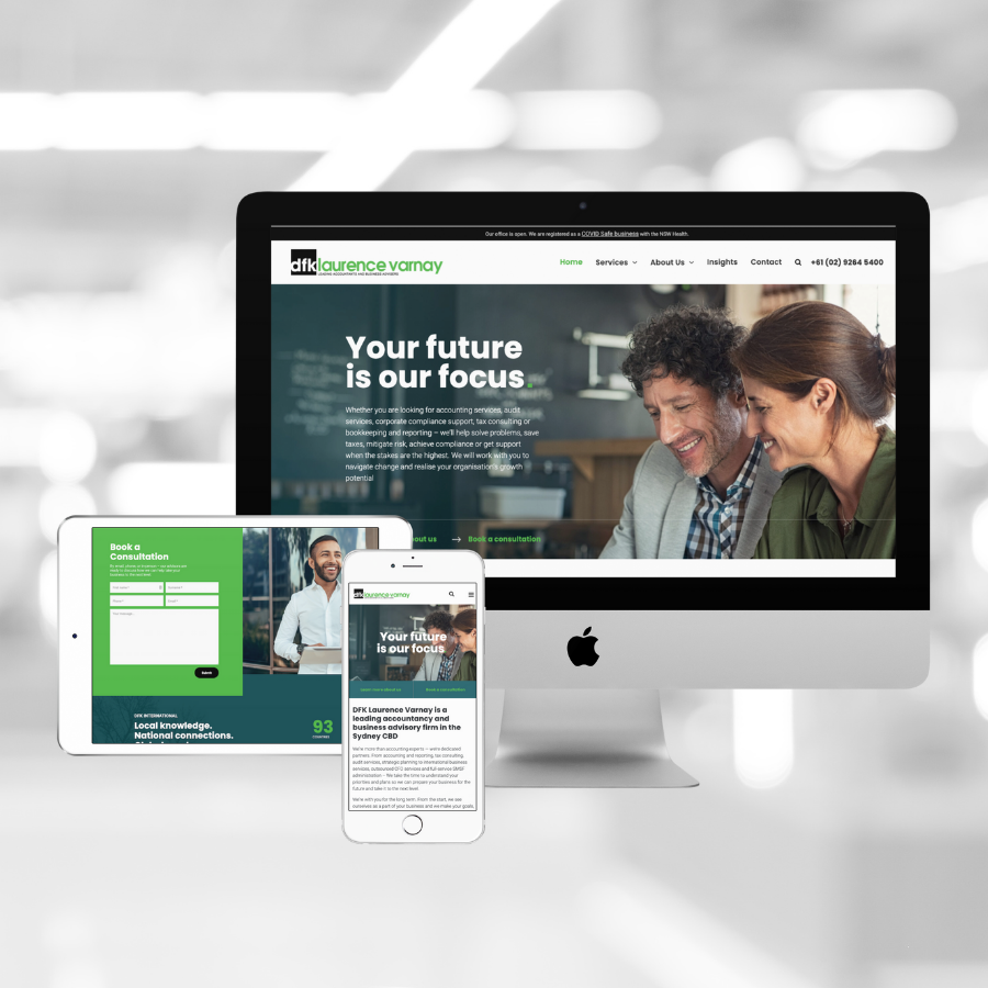
A website redesign to enhance user experience, elevate brand perception and generate leads
Featured Client: DFK Laurence Varnay
Before
After
DFK Laurence Varnay (DFKLV) is a leading accountancy and business advisory firm in the Sydney CBD. They approached Method+Marketing to help redesign their website with goals to improve the general visual appeal, enhance content for search engine optimisation (SEO), gain a more intuitive user experience and increase online lead generation for their services. It was also important that the new design incorporated their branding in a way that aligned to their parent brand – DFK ANZ, yet set DFK Laurence Varnay a bit apart in a unique way.
The Problem
It had been several years since the website was originally built and it was starting to look outdated. The design, content and imagery on the site did not properly reflect the DFKLV brand and the types of customers they service. Additionally, their website content did not reflect the services they offered and wanted to be generating leads for. The content was short and did not go into enough detail to properly outline DFKLV’s expertise and the value they could bring to their clients. The site also did not have any call-to-actions throughout the web content to encourage leads to convert.
The Process
We decided to redesign the website on their existing platform: WordPress. WordPress would enable them to update the website on their own, track and manage leads and place call-to-actions when and where they needed.
After our project kickoff meeting and project timeline was completed, the next step was the design of a new sitemap. This is where we outline the information hierarchy, map a more efficient navigation structure and ensure that the service offering is clear and simple to understand from the user’s perspective.
The next step was to deliver wireframes of the desktop and mobile designs. Wireframes are basically the skeleton or prototype of the website. With a wireframe, we can easily outline the website layout and where specific elements will be placed. It helps demonstrate how the end-product will look, and behave, before imagery and content is populated on the site.
Once the wireframes were approved, we began the content creation process. This involved a photoshoot with the DFKLV team in their Sydney office, before we got started with the copywriting process. “It was really important that we elevated the perception of the DFKLV brand through imagery and tone of voice,” said Angela Henderson, Director of Client Services at Method+Marketing. “We really wanted to highlight their approachability and professionalism while also focussing on the fact that they are located right in the Sydney CBD.”
As part of the copywriting process, it was really important that we made it clear what types of businesses DFKLV works with and what services they offer. On the previous website, it appeared as though DFKLV really only worked with small and micro businesses, but this simply was not the case. In fact, they work with many large businesses in Australia and internationally. Likewise, when we asked DFKLV what some of their main services were they highlighted their Outsourced CFO Service and International Business Support service, both of which were not mentioned on their previous website.
Once the web content was finalised, we contacted some of DFKLV’s clients to prepare testimonials to place on the new website. Testimonials are very important in building trust and earning respect from your web visitors.
While the content and testimonials were being finalised, we also began mocking up the complete responsive website designs based on the wireframes with imagery from the photoshoot, new content and improved graphic brand elements.
The Result
- A redesigned sitemap drastically improved user experience and site navigation by outlining each individual service and cleaning up a messy resources section.
- Featured service card elements on the homepage and services page helped clearly outline the DFKLV service offering and the value they can bring their clients.
- A bold call-to-action to book a consultation was added to several website pages, making it easy for users to convert into leads as soon as they’re ready.
- The photoshoot and copywriting process helped elevate the DFKLV brand perception and capture their approachable and infectious personality. Revamped, SEO focussed content also made it extremely easy to find and understand DFKLV’s services, while also outlining exactly what DFKLV can help with on each service page.
- Client testimonials were added to help build trust and connection with potential new clients.
“This case study is a great example of showcasing how important site navigation and thoughtful copywriting can be to your user experience, “said Katie Cowling, Director of Digital at Method+Marketing.
“By fulfilling your users’ needs and expectations, you can build better customer relationships, generate more leads and connect people to your brand.”
We are incredibly happy with the final outcome. Check it out at dfklv.com.au.
If you are interested in redesigning your website to optimise for lead generation, contact us.
Have questions?
Ready to get started?
We would love to chat with you about how we can best work together.
Book a time to have an online video chat with our Director – Client Services, Angela Henderson.


